P1
INTRO
Photoshop task 1

Before images:


1. Paint brush
- I used the paint brush to apply strokes with whatever tool I was using. It is a broad tool which I used for most of the other tools. For example, when I put the elephant behind the traffic light post, I had to use the brush tool to add or remove the elephants ear so that it was behind the post.
2. Selection tool
- I used the selection tool to highlight the elephant, and to cut out the background. I used keyboard shortcuts such as 'ALT' to change the mode of the selection tool, either adding or removing the selection line to make it fit perfectly. This was useful as could cut the image of the elephant out as a neat PNG.
3. Layer mask
- I used the elephant cut out mask that I had highlighted so that I could drag it into the busy street image easily.
4. Stamp tool
- I used the stamp tool to get rid of the mud from the elephants foot.
Photoshop task 2

Before images:


1. Quick selection tool
- I highlighted the head of the man and cut it out. Once inverted, I dragged the head onto the other image.
2. Refine edge: Overlay
- I used this to make the head cutout as smooth as possible and as natural looking as possible once moved to the other image. I got rid of some mistakes and managed to smooth out the outer outline.
3. Refine edge brush
- I used this tool to smooth out his beard and hair. This made the hair strands come out, instead of being a straight line cut out.
4. Clone stamp tool
- I used this tool a lot to mainly remove parts of Ed Sheeran's head that was sticking out behind the man's head. I also used this tool to overlay the scalf on the mans neck
5. Dodge and Burn tool
- I used this tool to make the head look more natural, by adding lighter parts to his face, it gave more natural looking effect. I also added shadows on the right side of his face, as the sun was coming from the left. Dodge is for lightening up the image, and burn is for adding shadow.
Photoshop Task 3

Before images:


- I used this to add a gradient overlay to blend the bottom of the couple image smoothly with white.
2. Free transform
- To re-size the image and manipulate it.
3. Gradient tool
- I used this to drag the beach photo into the couple photo, giving it a smooth transition effect. This removed any lines too.
4. Text tool
- I used this tool to add 'Couple Love' to the poster, and changed the colour to dark red with the colour overlay option. Then I resized it with free transform and centred the text.
Task 1
Pre-Production Materials
Research: Film Poster analysis
Poster analysis 1: Pirates of the Caribbean - Dead Men Tell No Tales
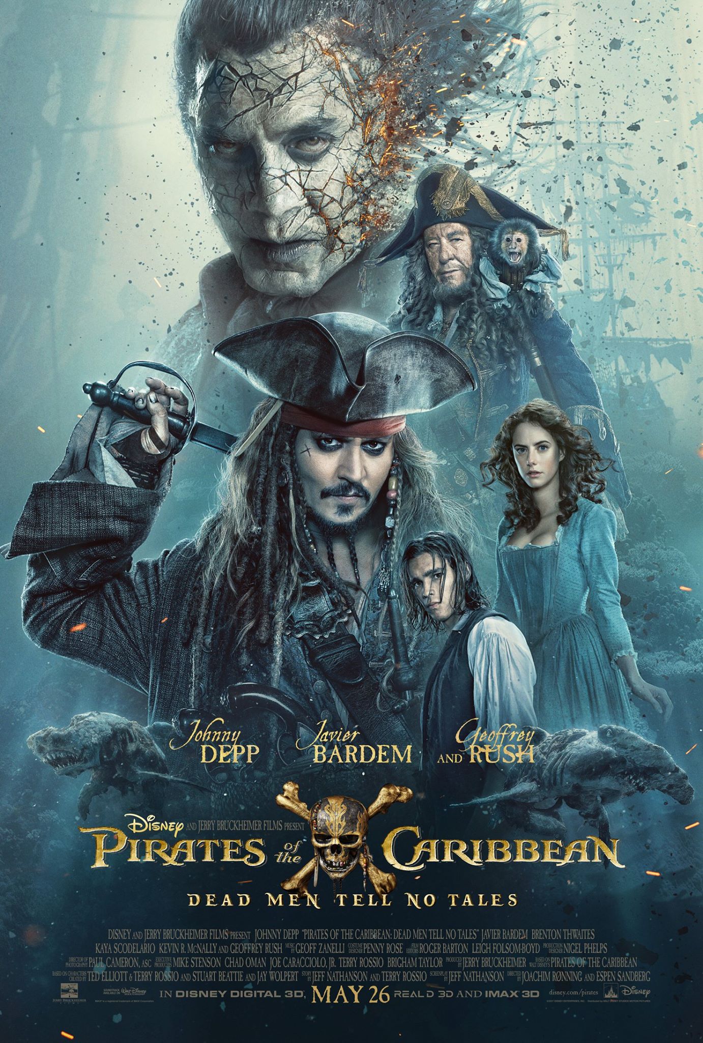
- Release date is shown in bold at the bottom.
- The film title is in the center, along with the iconic logo in the center.
- This poster uses star billing, with the main stars before the title of the film.
- Jack Sparrow is in the center of the poster, standing out, as he is the most recognizable star of the Pirates movies.
- The Disney logo is small but noticeable by the title, next to the directors name.
- The name of the Pirates movie, 'Dead Men Tell No Tales' is underneath the main title, catching public attention.
- All the main actors are all in the poster, with the main villain being the biggest and at the top of the poster. The image used shows he is a villain, and gives the public a better understanding of what the film could be about.
- The actors are sized differently too, with the most important being the biggest and the not-so important being slightly smaller.
- The credits are packed tightly, with every single actor, including the director at the bottom in small writing.
- By the release date, there is more branding, such as IMAX 3D.
- There is no tagline.

Target Audience: In my opinion, the target audience are children or teenagers who have previously enjoyed the Pirates movies, as the poster here is very focused on the main key movie characters, catching a young persons attention. However, the previous Pirates films have been directed at all age ranges.
Poster Analysis 2: Baby Driver

- Title is in bold, stands out.
- The release date is in the corner, standing out with the same text font colour.
- The star billing starts with each key actor labelled from top to bottom. The most important main character actor Ansel Elgort is at the top. Their surnames are slightly larger to emphasis their names.
- The main actors, who are leading characters in the movie, are all in the poster. The main character is the biggest, with the other characters overlaid, getting smaller further down. Also, the way each actor is laid out is almost exactly in order to the star billing.
- The director and writer, Edgar Wright, is in bold, above the title of the movie.
- The tagline is featured under the movie title.
- Social media trends are at the bottom, with #BabyDriverMovie
- Production companies are shown clearly at the bottom, underneath all of the credits.

Target Audience: The target audience, in my opinion, is aimed at young adults. This is because, unlike the Pirates poster, this poster isn't as overwhelming with the main characters. Therefore, it has a more mature feel to it, with violence implied too. If it was aimed for the younger age range, there would be less writing, and more images.
Task 2
Pre-production materials
Planning: Creating own idea
a)
Poster ideas mind-map
Task 3
Film idea and Mood board
Mood board 1 - Action/Adventure/Thriller/Horror/Sci-Fi

Genre Characteristics
1. Character
- In this mood-board, you can see that the main character is the most significant in my poster. In most of these film posters, it is the main character only. The characters personality could possibly be quite serious and formal, as you can see most of these posters related to my theme of Action, Adventure, Thriller or Sci-Fi are straight faced. I have focused more on the technology side of the character, as I want them to be a good hacker. For example, the 'Mr Robot' poster, top left, is perfect for what I want my character to look like, with the hoodie and text over the face effect. Furthermore, I want my character to look mysterious and smart, like the 'Creative Control' poster where the character is wearing sunglasses with colour reflecting. However, I was also thinking about a 'Racing driver' film style where the character featured is the main driver of the movie, for example, the need for speed poster is ideal for what I was thinking. As for the horror genre, I want my character to look scared with the possible killer behind them, like the bottom left poster. As for the antagonist, I preferably don't want them to be the main part of the poster, but I would like them to be in it, possibly in the background somewhere.
2. Settings
- For the action and adventure genre, I want the colours to be between bright and dark, maybe black and white with one stand out colour, like the Alex Cross poster. For each of these posters, the setting is varied, which is good, but I noticed that most of them have limited colours. I like this look as I want a certain part of my poster to really stand out, for example, in the Baby Driver poster at the bottom, where the reflection is the main focus. After looking at the posters, I realized that the blue tint and black effect works really well. Some of the posters have very vibrant colours, such as the Moonlight poster, which would look really good for the technology hacker type theme. The backgrounds for each of the posters are similar, being quite plain and just one colour, which makes the featuring image stand out well. I like this idea, however, I would preferably like to have some sort of background, maybe a city or something, like the Inception and Watchmen poster. But overall, the setting for each of my genres should preferably be dark but have one main colour part that stands out.
3. Iconography
- Iconography is when the movie poster tells you the main theme without telling the actual story. Using imagery can establish the films plot while looking iconic and can be a good way of catching the audiences attention without giving away too much of the story. Types of iconography are shown in my mood-board, for example, some have text over the main characters face, with a bold text font making it stand out. Some use sex appeal, contrast and setting which all grab the audiences attention. Lots of the movie posters I used here stand out a lot due to the contrast used, some use just one base colour such as red or yellow, which stands out. Furthermore, some of them use just two base colours, such as black and yellow, which is a really good effect as it might be seen as plain, but it results in a really good stand out effect. The text, as I mentioned, is bold and stands out with a basic font used, which once spaced out, works really well, and it works for any poster, so I will aim to use basic font types for my poster. Lastly, certain colours tend to represent the movie's theme well, such as red blood for horror with a black background; the audience instantly knows what the movie's genre is.
4. Themes
- Each poster has their own theme. For example, some have the main character and nothing else, either with a close up or a behind shot. Some of the themes used the big head over another image, which is a good effect that I am thinking about using. However, none of my poster examples use the back to back effect, where two characters stand back to back, like the famous film 'Pretty Woman'. My favourite action movie theme is the black and white effect, as I instantly know it's an action movie poster. As for my poster, I would like to use the high contrast effect, with whatever genre I choose. If it was the sci-fi or thriller genre, I would use a technology type theme with possibly black with a blue tint. Or if I was using the racing driver theme, I would use the cars paintwork as the main part to stand out, like the Need For Speed poster. As you can see I have lots of different ideas that I could use, and the themes in these posters are very helpful in picking my posters overall look.
Mood board 2 - Games/Posters/Magazines/Books/Advertising

Task 4
Creating a poster using the materials given

Task 5
Poster plans

This is a poster promoting 'Alex Cross'. I really like this design, and I have highlighted the main parts of the poster.

Here is my first layout design. I was inspired by the 'Alex Cross' poster, and this layout is very similar. I want the main character to be either facing away or towards, and to be faded out with an overlay of the city with the villain standing on a building or something else. The colour would be dark with one pop out colour, just like the poster example, because I really like how the title of the film doesn't have to be too big in order for it to stand out. As I explained, the images will be blended over each-other, like the 'Alex Cross' poster above. As this will be related to my hacker story idea, I will base the background in a city such as New York, and the main character will be holding a phone. It will be like the 'Alex Cross' poster but the gun he is holding will be replaced by a phone. There is quite a lot of blank space in this layout, which is why I will most likely do a portrait if I was to use this design. The layout is typical for a poster, with the taglines, actors and reviews all at the bottom, making the film icon image stand out. The credits are at the bottom, as most film posters use this technique, having the most interesting part at the top, and least at the bottom. The font I will use will be very bold for most of the text, apart from the credentials as they will be small, like a film poster. The genre will be clear to the audience, you will be able to tell that it has action involved, as I will maybe have the main villain holding a fake pistol. Furthermore, the simple two tone colours tells this, as most action movies use this effect. But overall this layout is inspired by the 'Alex Cross' poster, and the end result would look very professional and high quality; like a film poster.

10 Potential working titles
1. Vigilante
2. Hack
3. Download
4. The Truth
5. Black & White
6. Network
7. Social Virus
8. Algorithm
9. Hacker
10. Network Protocol
6. Network
7. Social Virus
8. Algorithm
9. Hacker
10. Network Protocol
Key words:
Display type - What most movie posters use.
Display type - What most movie posters use.
Hierarchy - Order of importance.
Kerning - The space between two characters.
Leading - Space between two lines.


Thor Ragnarok Poster Text Fonts

Alex Cross Poster Text Fonts

Task 6
Pre-production text designs
a)


Photoshop title tutorials

For this image, I followed a YouTube tutorial to create a glitch effect.
Firstly, I used the font 'HACKED' and created three text layers. Then I changed the colour of each of them, and overlaid each one. I had the three at the same height but with different widths on the page, giving a glitch effect. This screenshot below shows the three text colours dragged away from each other.

These are the layers I used, I renamed each one to make it easier for me. The yellow error icons are because I opened the file on a different computer so I don't have the font installed. You can see how I added the Inner Shadow effect on the white text to give it more of a smooth finish.

Link to tutorial: YouTube Video - Glitch Text Effect
For this image below, I didn't follow a YouTube video, instead I took an image of New York, and used the 'CITY SCAPE' font to give a good looking effect.

Task 7 - Colour Scheme
Credit Block draft


Anologous

Complementary

Split Complementary

Tetradic

Triadic

Chosen colour schemes:
Red, blue and yellow: I chose this triadic colour scheme because there aren't many movie posters with this colour scheme, as I'm aiming for a more unique design. These colours will catch the audiences attention due to them being to bright and eye-catching. Furthermore, most movie genres use the triadic colours, such as thriller/action.
Blue and orange: These complementary colours are the most well known colour schemes for movie posters, specifically dramatic movies or action movies. Therefore, I have chosen this colour scheme to match with my genre being action/thriller. The audience also would find these colours aesthetically pleasing to look at as the two colours work well together.
Task 8
Poster test
Before image, taken in the studio:

After image, edited in photoshop:

Second edited image:

Outfit inspiration:
- These two photos inspired me for my outfit because Mr. Robot is about a hacker wearing a black hoodie and the mission impossible poster shows, again, the main character wearing a hoodie. This simple idea inspired me to wear a hoodie for my poster.

My outfit:
My outfit will be a simple plain black hoodie with no logos on it to help me when it comes to editing.

Comments
Post a Comment